The ONA annual conference is our biggest event and since its inception, it has been given unique branding each year. Sometimes that reflects the subject matter, other times the host city.
This year, I set several goals for the process: engage our outside consultant on a larger scope, begin our design process earlier and focus on a holistic package rather than individual deliverables. Some of these goals still need some work in 2019, but I’m excited to share this year’s progress that culminated in the ONA18 Style Guide.
Driving factors for improvement
ONA17 was my first ONA conference as a full-time staffer, and I was amazed by the many materials that needed to be designed to prep for the event. With each item, I struggled to find inspiration and continuity due to the time constraints, but also the lack of creative process.
For ONA18 I worked with our design consultant, Joyce Rice, to create a package of items that would allow our designs to be flexible and creative, yet consistent. We want branded materials to work in different media and serve different purposes, but the audience must relate them to each other. This approach was a departure from the year before, when we asked Joyce to design the conference T-shirt, program guide and tote bag, then never used her work elsewhere.
Starting from scratch
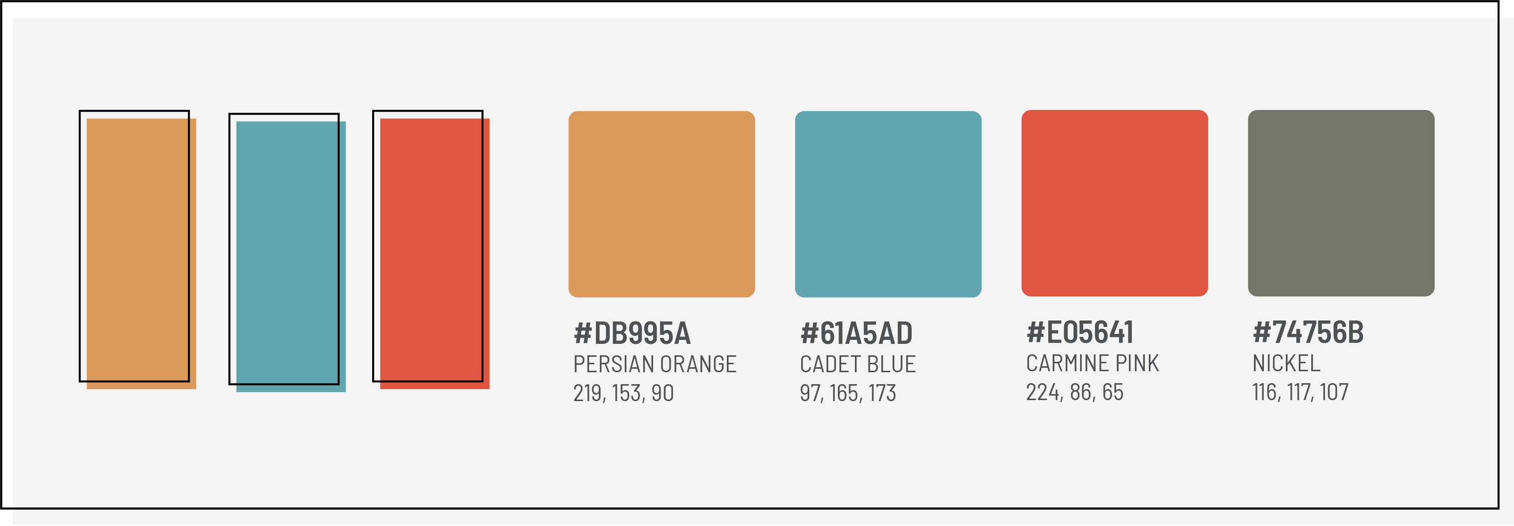
I wanted to draw inspiration from Austin itself — after all, location is usually the most unique change among each year’s conference. While researching the city and its culture, I was struck by this mural on Sixth Street that pulls in three primary colors while making big statements with the typography.
This mural and photos I liked of the city — including the city skyline and the neon signs of Austin’s famous Sixth Street — drove our color palette selection. Rather than going with a bright neon palette, we took a cue from a more muted Austin City Limits sign, which helped us settle on the three colors for the ONA18 brand.

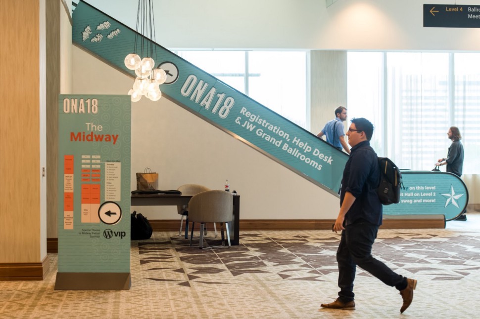
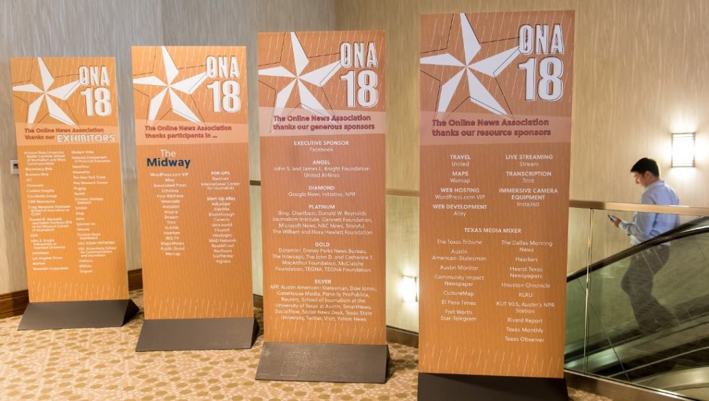
The ONA18 palette includes Persian Orange, Cadet Blue and Carmine Pink. We used a gray called Nickel for our dark backgrounds. Here’s how they all look together. (Tip: My preferred color palette generator is Coolors.)
The conference logo and icon library
Based on the wall mural, I settled on a typeface for the logo pretty quickly. So quickly, in fact, that I no longer have the original file that includes the name of the typeface. That will have to remain a mystery for the moment.
The other design touch I added without much iteration was an offset black border, which hearkened back to my newspaper days when the black printing plate wasn’t quite aligned properly.
From there, Joyce embraced my idea to develop a menu of icons that would address our need for flexibility. We went through an exercise to create a list of the things that come to mind when we hear “Austin,” as well as some journalism-related items.
Here’s a look at each phase as we iterated to a final set of icon elements.
Truth be told, I absolutely love Joyce’s unrefined notebook sketches. We may go that route for a conference in the future! But to pair with our clean typeface, they needed to be refined through Adobe Illustrator.
Here’s a look at her final library.
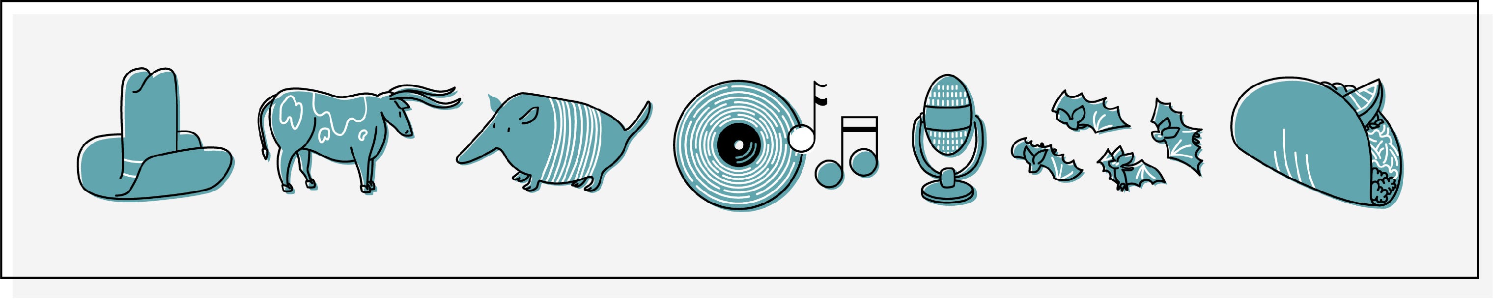
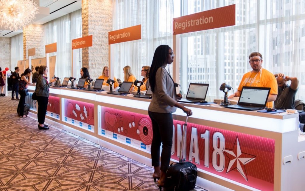
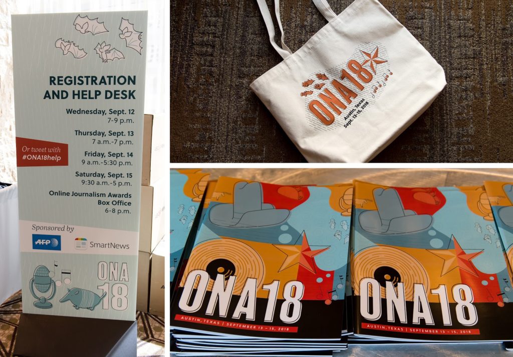
The library includes a cowboy hat, a longhorn cow and an armadillo to represent Texas. A vinyl record, microphone, a colony of bats and a taco (shoutout to Torchy’s) capture Austin. The primary logo contains a star — an ode to the Lone Star State.
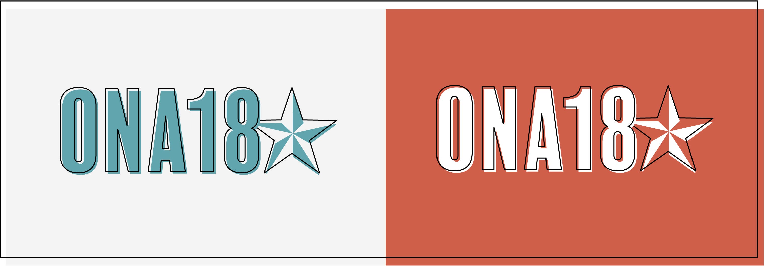
The main ONA18 logo, with an ode to the Lone Star state.
With our icon menu and our three primary colors, there were dozens of options for logos that we could use across conference collateral. We also took into account the situations in which we’ll need an alternative vertical logo or square logo. Additionally, Joyce pointed out we’ll need versions for dark backgrounds and color backgrounds. Suddenly “dozens” of options seemed like an understatement.

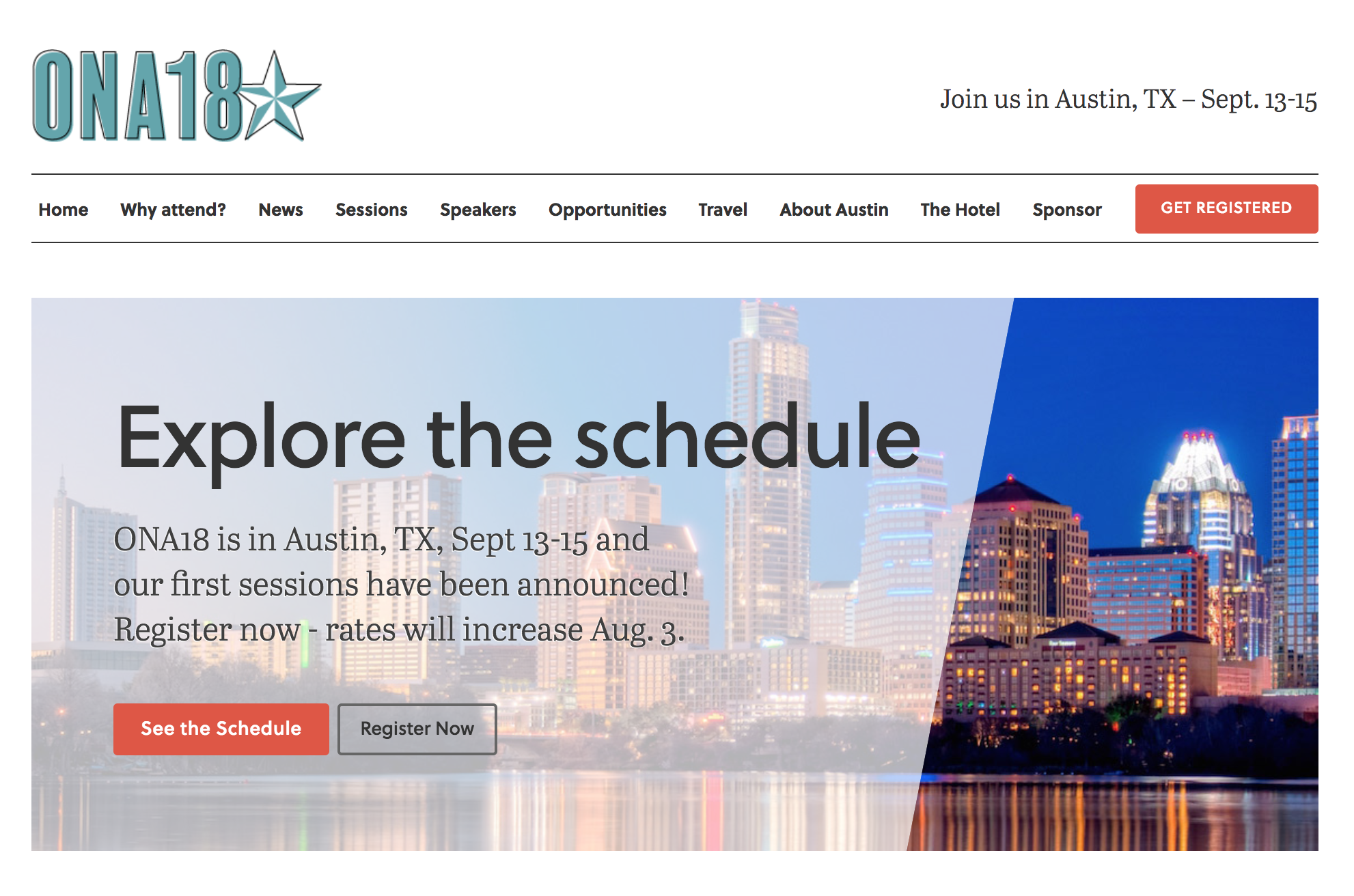
Versions of the ONA18 logo that we used on light backgrounds.
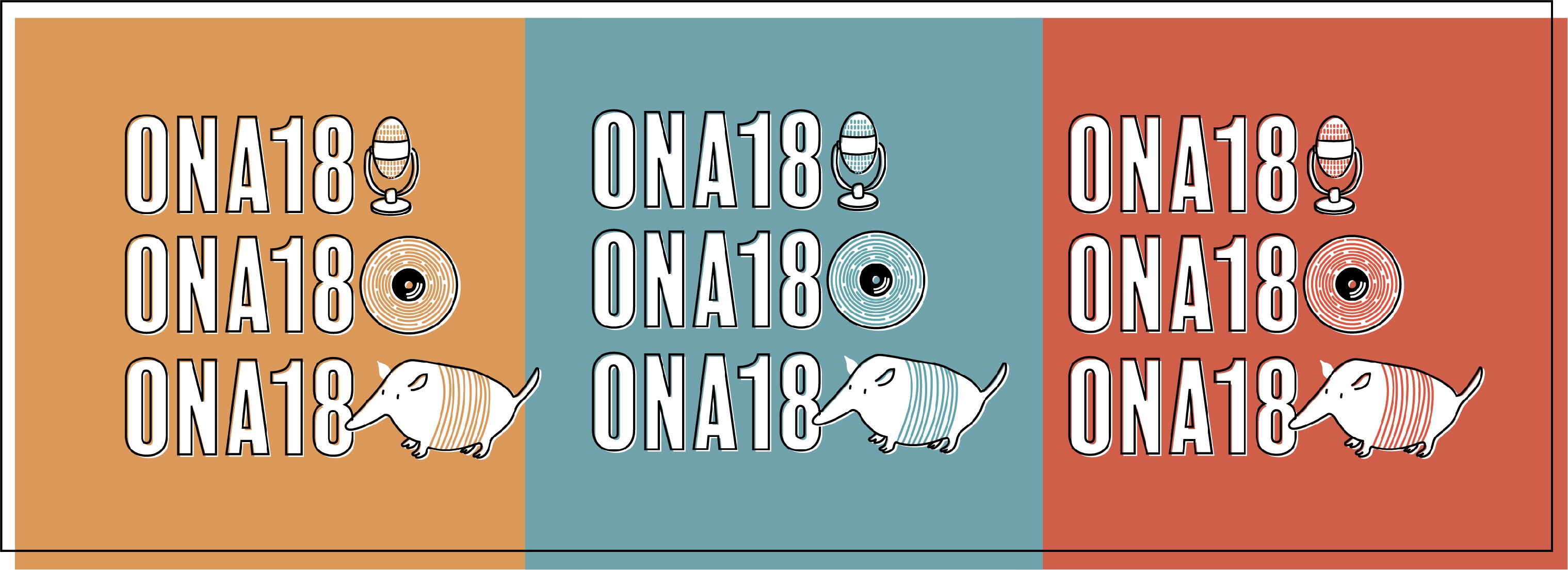
On color backgrounds, lines in the elements changed to match the color.
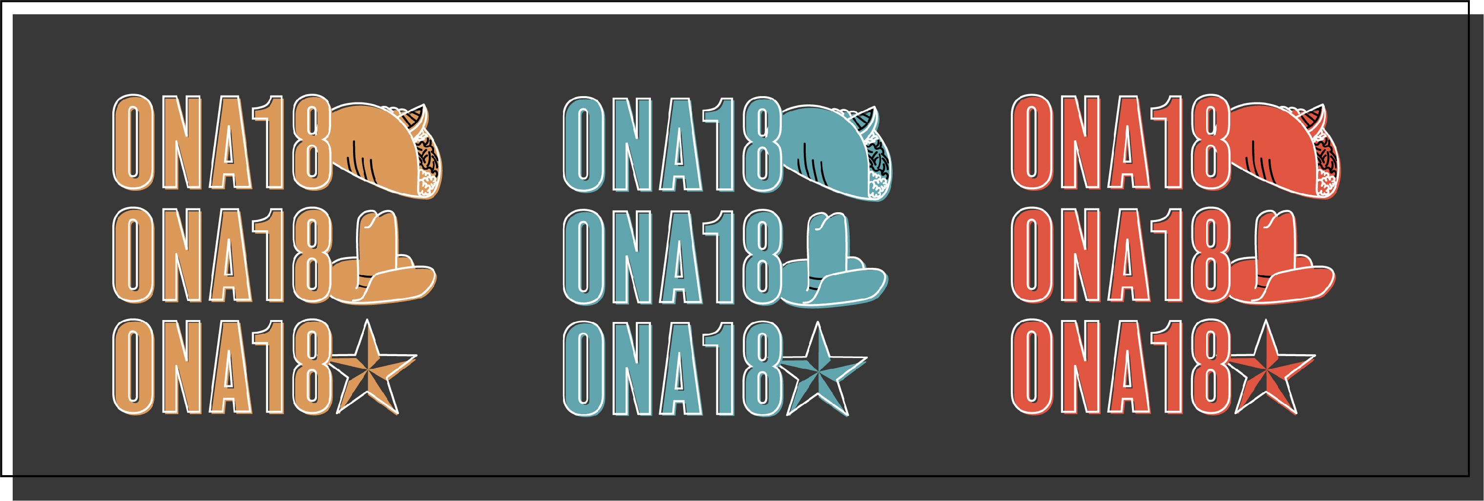
Dark backgrounds inversed the white and dark lines.
Typography
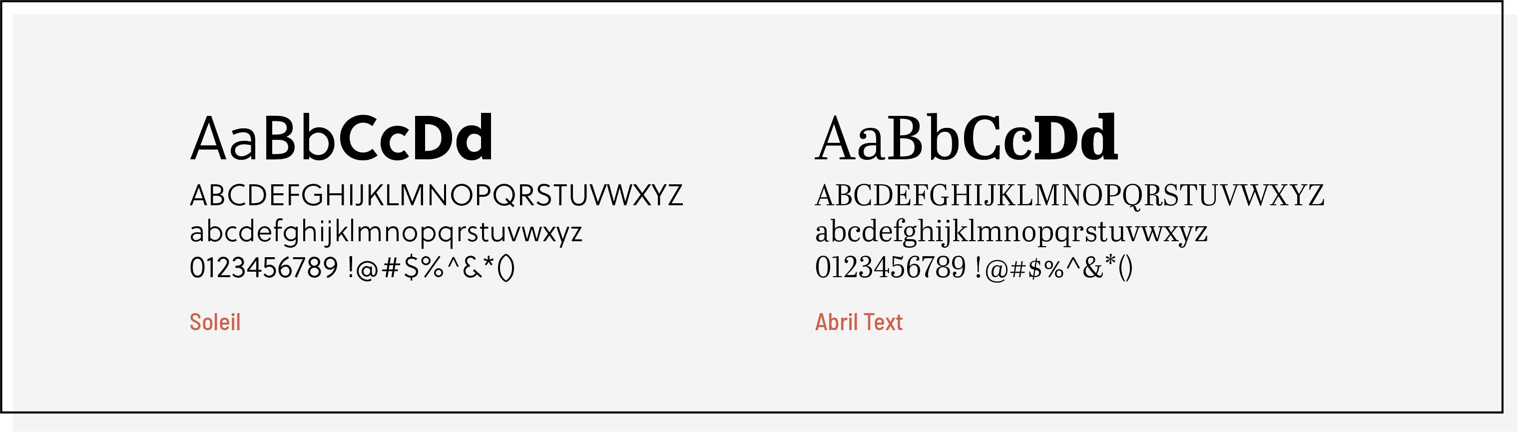
It’s my preference not to overuse a logo typeface, so in designing the website I settled on two types that complement each other with similar x-heights and densities.
We used Soleil as our main display font — you can see it in our headings and navigation on the website, and it also appeared on posters and other materials on-site at the conference. For body copy, we used the serif Abril Text.
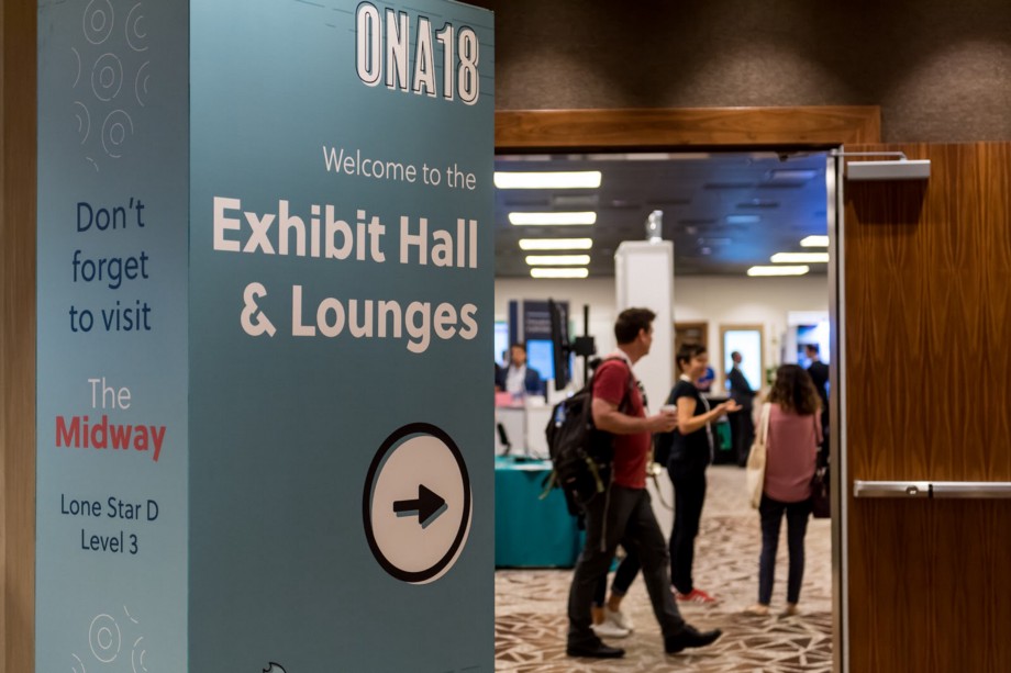
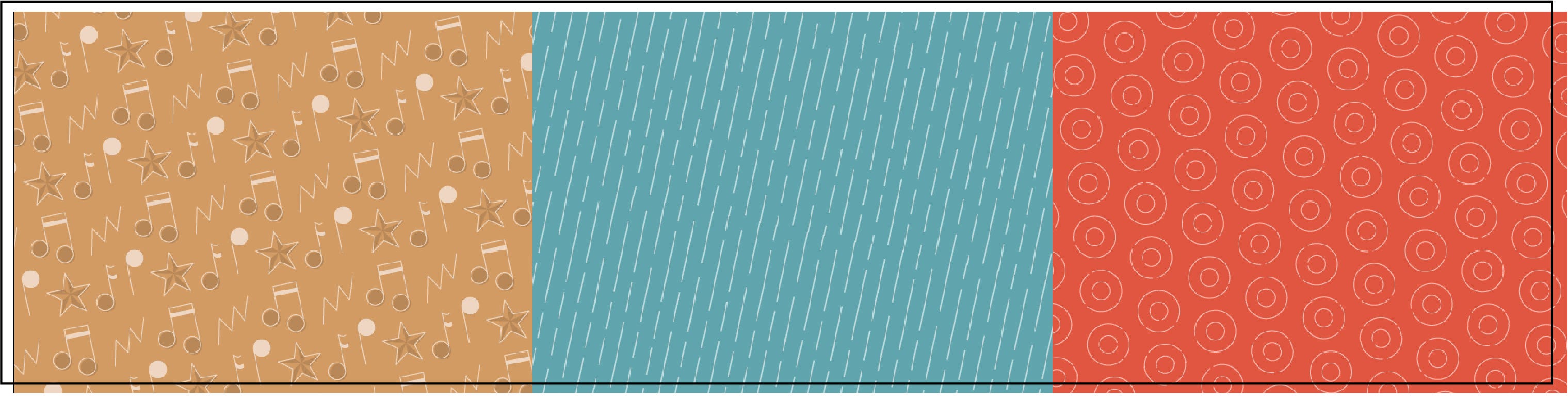
Patterns
To round out our whole style package, I asked Joyce to design a few complementary patterns for us. Patterns really help guide brand design because they extend the options a designer has to work with.
For ONA17, we used the street map of Washington, D.C., in a lot of our materials. This map was only part of the branding because our web contractor used a version as the background image of our website. As the only pattern available, and one prominently featured on the website, this map became something I relied on throughout the process.
For ONA18, we intentionally created patterns to serve as backgrounds and accents. We went through a process similar to the icon design to create a set, first sketching by hand and then refining in Illustrator.
Joyce’s work varied from simple to complex to a little trippy. Ultimately we settled on three patterns. The series of musical notes is a fun version we used sparingly, while we featured the other two — lines and circles that both emulate our record icon — more frequently.
Check out the ONA18 style guide on Behance.
This systematic, full-package approach to conference branding was a new approach for ONA — and it paid off in the feedback we received from attendees as they experienced ONA18. We heard from many people who noticed how the branding flowed from one element to the next.
Time constraints in the process remained an issue, however, and I hope to iterate on that again this year for ONA19. Still, we were able to make a splash with our branding in several places.