This fall will be my third Online News Association conference as a website contractor. Going into the planning of this conference I offered to additionally design the conference logo. A good logo, I argued, needed to be adaptable – wide for a website header; square for social media and other displays.
My creative process went through several iterations, but the basic premise driving the logo was to be the city of Los Angeles. The logo should feel like the city.

First I thought “what’s more recognizable in Los Angeles than the Hollywood sign?” Using the Basecamp logo as inspiration, I tried a cartoonish mountain range with lettering. But cartoonish was right. This was never going to work.
Next – the Oscars. Spotlights in the sky. I didn’t have to iterate on the lights much to realize I didn’t like them. Plus in this version the typeface on the numerals didn’t really work. Moving on.
But I liked the idea of having some graphic to the right of the conference name. I started digging through icon fonts and put together a few mocks. One with talk bubbles was my favorite; it applies to the conversations at the conference but also subtly refers to the Hollywood gossip scene. Unfortunately, this was too similar to the ONA 11 Boston logo.
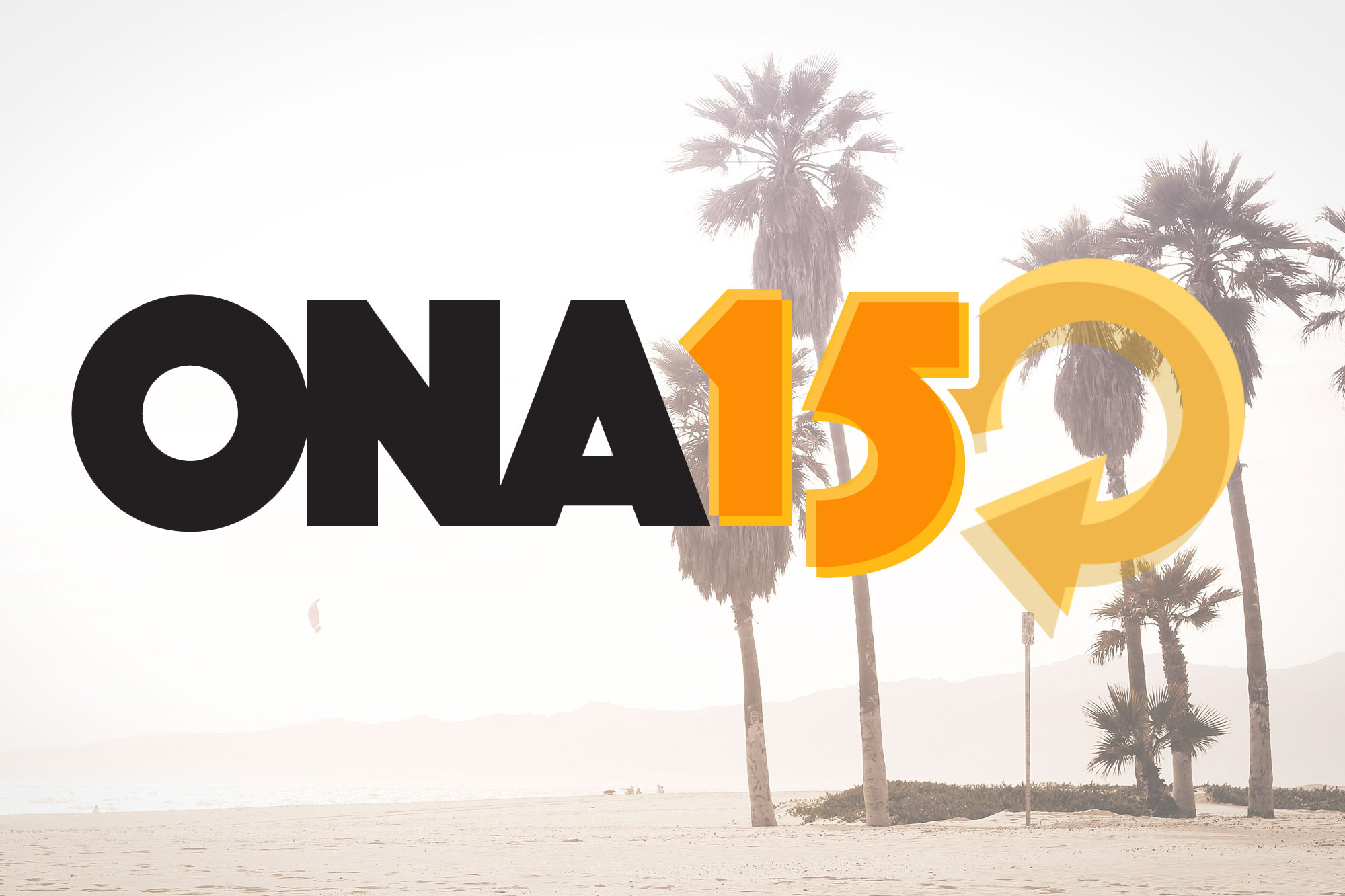
My last mock appealed to the retro aura of Los Angeles – the ’70s nostsalgia surrounding Studio 54. I changed the typeface and instead of icons went with these circles that changed opacity, attempting to symbolize the lighting in a disco.
The ONA crew like the retro typeface the most, and agreed that a icon would be better in that spot. I threw together several mocks of icons I that, first, worked well with the typeface and, second, could serve as a symbol for the conference.
“Refresh” is what we settled on. This applies in so many ways: LA is such a refreshing city; the conference attendees will be refreshing their skills; and it’s a refreshed look for a new conference.
One, that might I add, in which I was excited to have a larger part. You can see it in action on the ONA15 website; and it’ll be great to see in person come September.