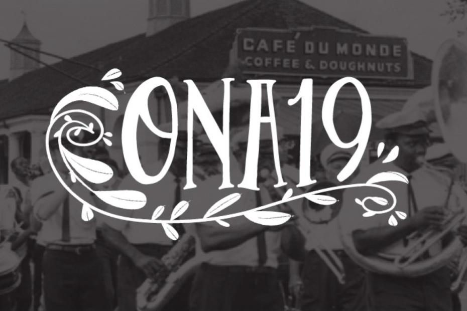
The ONA team is incredibly excited to bring our annual conference to New Orleans for the first time. It’ll be a fitting location to celebrate our 20th anniversary with some fanfare. Yet, despite the city being rich in history and culture, it is often overshadowed by Bourbon Street, Mardi Gras, and the alcohol.
In our design for the ONA19 logo, we wanted to embrace the beauty of New Orleans, seen in its architecture, gardens, and people. Once again, I collaborated with Joyce Rice to put together the illustrative elements of our branding (Joyce worked on the brand for ONA18, and some ONA16 and ONA17 elements as well) — and the result is a look we’ve never had before.
Inspiration
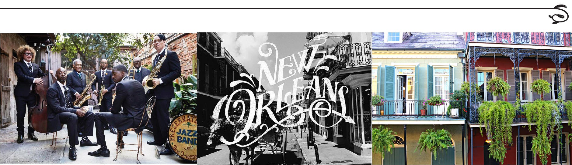
Founded in 1718, New Orleans just celebrated its 300th anniversary. It’s known as the birthplace of jazz music and a unique merging of French, Spanish, and Caribbean culture. Naturally, we looked at these elements when considering the look of ONA19. We wanted the conference to have a classic look that reflects our host city, as well as the fact that we’re celebrating our 20th anniversary.
In the design process, Joyce and I channeled hand-drawn illustrations seen in New Orleans marketing, with embellishments that reflect its cultural roots. We considered the style of popular local jazz bands like the Preservation Hall band — their sleek black suits and ties. We also incorporated the craftsmanship of the wrought-iron elements in the city’s architecture. Both of these sources — musicians and architecture — have a healthy dose of spirit and life for which the city is known
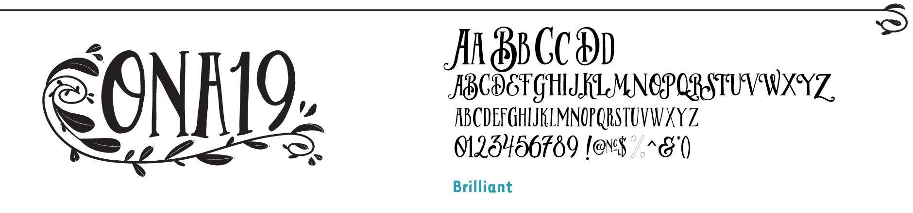
Logos
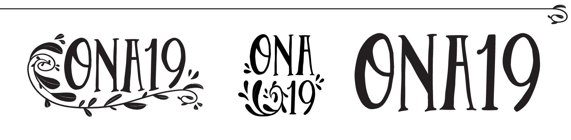
While scouring for hand-drawn fonts, I found Brilant, which gives just the right amount of character and curves. The embellishments were drawn by Joyce and, along with a few light type modifications, give us a historic look that reflects the pride we have for the conference.
I always like to have multiple logo versions for flexibility. The main logo can be used at medium to large sizes, while the type-only wordmark can be used at smaller sizes, or if I’m using over graphics. Meanwhile social media begs us to have a square version.
Colors
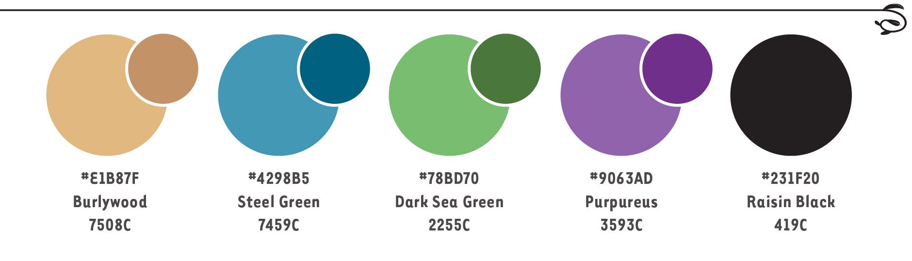
I love the vibrant paints of architecture around New Orleans, and wanted to pay a nod to that palette while bringing out the spirit and liveliness of ONA.
At first, I wanted to avoid the full Mardi Gras palette. But as we researched, we discovered that these colors run deep in the veins of New Orleans. Many of the bright homes in the Garden District and beyond share them, and they were first chosen to represent the ‘kingdom’ of the King of Carnival. Who are we to not pay respect to our hosts?
Our primary accent color is a gold called “Burlywood,” chosen because of its relevance to the city but also because the vision is for a classic brand that reflects our anniversary. For the secondary colors, we changed the shading to be less flashy and added a blue to give us our own, unique palette.
Typography
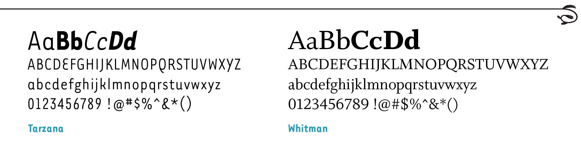
Brilant is a design typeface, with only one weight. To reinforce the logo’s aesthetic, I don’t plan to use it much elsewhere. For our website and other designs, I needed to find a serif and sans-serif that had similar character.
Tarzana gives the brand some of the same lively curves found in Brilant, and Whitman matched well with a similar x-height and just a dab of character — particularly in the italic version.
Patterns
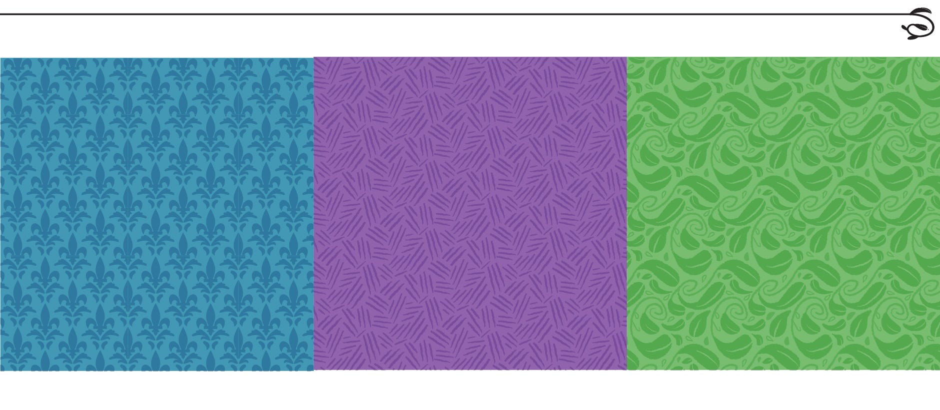
A set of flexible background patterns carry the character of ONA19 beyond the logo. Each pattern can be paired with any of our colors, clearly but subtly invoking the same classic, lively spirit as the logo.
Dividers
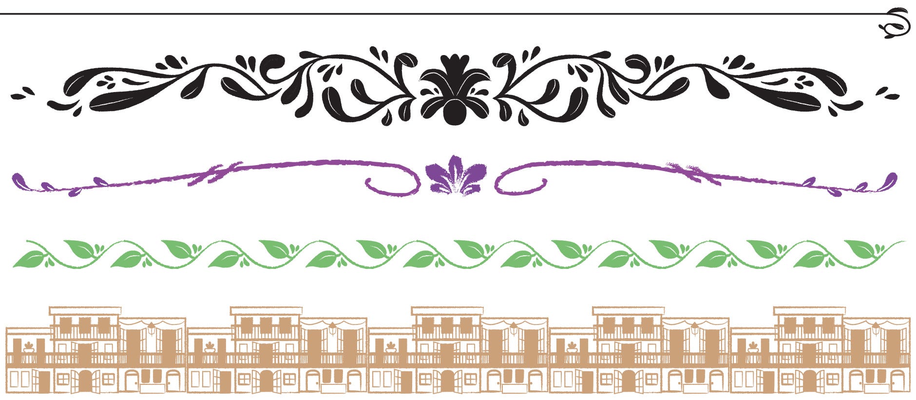
This is the first year we have graphic dividers as part of our branding, and I’m already loving them. We saw these types of elements a lot while researching New Orleans, and they are a great way to insert our branding in the middle of text while not relying on any overwhelming elements.
The streetscape is more of a stopping point. We’ve used it first at the bottom of the ONA19 website footer, and it’ll be used again in printed materials at the conference.
Graphics
As with previous conferences, Joyce developed art elements as part of the ONA19 branding. This early in developing the full conference brand, it’s harder for me to articulate exactly how our graphical elements will be used. However, they provide an extra layer of character so I don’t need to use a stock photo or the ONA19 logo. These will most certainly come into play when we design out conference T-shirt, tote bag, and map book cover.
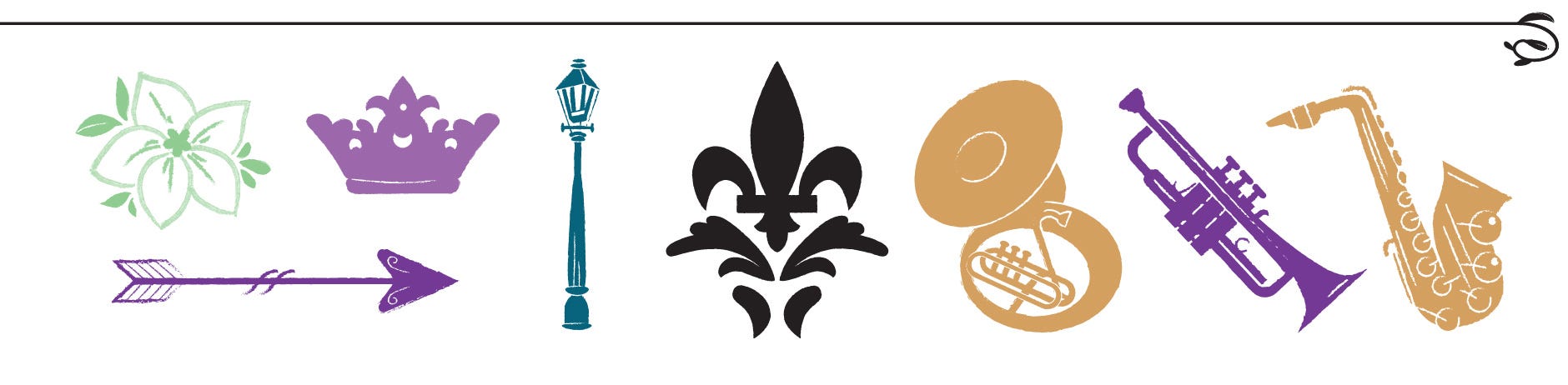
Iconography

Finally, one more new element to our design palette — icons. For ONA18, we introduced a new conference mobile app, Guidebook, which allowed us to replace the navigation with our own icons. I certainly appreciated the chance to bring our branding to the mobile experience, but it was added only a month before the conference.
This year, we expect to launch the app a lot sooner and suited up with the ONA19 brand. The icons themselves come from a free selection at Flaticon, from which I’ve done a bit of mix and matching. To get them on-brand I’m adding some of the embellishments designed by Joyce.