For the 2020 Online News Association Conference, we look to celebrate what Atlanta is today: a city that has re-emerged as the “new cultural capital of America,” according to The Daily Beast. For the third consecutive year, designer Joyce Rice joined me to collaborate on this year’s conference branding, which brings a stroke of energy to the event.
As we dove into Atlanta’s identity, we quickly were reminded that the city’s journey to today has been a tumultuous one. Its role as a distribution hub in the Civil War made it a strategic target for Union forces. Racial tension persisted during Reconstruction as local and state laws institutionalized segregation. The city ultimately became an epicenter of the Civil Rights Movement, as Martin Luther King, Jr.’s hometown and thanks to a strong hub of Black-led community organizations, churches and businesses.
In the ensuing decades, the city has taken strides while embracing change and developed a character all its own. This is the spirit and energy we wanted to capture in the ONA20 branding.
Inspiration
Atlanta’s character has certainly made an impact on American culture. Coca-Cola was invented there. The city has played a growing role in the film industry, and there’s a long list of talented rappers who got their starts there.
As Joyce and I researched, we discovered that Atlanta is a leader in street art as well, having embraced the medium more than any other city we had seen. From the murals of the Atlanta BeltLine to the living canvas of the Krog Street Tunnel; with community art programs like Living Walls and OuterSpace Project; and beloved, eclectic landmarks like TinyDoors ATL, we found amazing street art and an active community in support of it. The more we learned, the more excited we were to let these colorful works inspire the look and feel of ONA20.
Logos
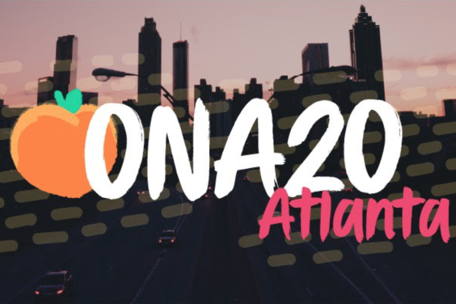
With our street art inspiration, we sought a brush-stroke typeface with an edge for our logo and landed on Stay Bold. All of our design elements feature brush strokes as well. In the logo, we introduce our Georgia peach. I concede that the peach is not purely Atlanta-centric — Georgia’s nickname is “The Peach State”, after all — but our research found plenty of Atlanta peach designs. Additionally, as our Communications Manager Karolle Rabarison later pointed out, a local cliché is that “all directions in Atlanta start with ‘Go down Peachtree.’” Those directions will lead attendees to our host hotel, coincidently.
Graphics
Beyond the peach we opted to keep graphics simple. Street art can get complex, but our branding needs to be flexible for use on dozens of signs, digital presentations and other print elements. We combined geometric shapes with paint squiggles and dots and can use these elements together in a variety of combinations.
Colors
Street art is all about color. After ONA19’s regal, black-and-gold heavy palette and ONA18’s muted red and blue design, I really felt like we needed to try something bright. After some experimentation, we settled on the palette above. During our process we were drawn to colors that were almost neon, and realized it began to create an ’80s nostalgic style. It’s no secret that pop culture is going through an ’80s renaissance, so we thought we’d embrace this beauty before the style fades again. Paired with our geometric graphics and the elements below, we felt like we achieved this in a subtle way.
Patterns
Now that we’ve created a bright, ’80s take on street art, we needed the patterns to match it. Our stripes are from Joyce’s artistic vision, while the hand-dotted lines provide a paint texture. Two gradients round out our options for backgrounds, and really help complete the look.
Typography
Normally, I wouldn’t use our logo typeface anywhere else, but this year it creates the exact aesthetic we wanted, so we’ll be using Stay Bold again on signs. We do not have a web version, however, so I found CC Sign Language to use on the website. It’s not exact, but we won’t be using it much online.
For other fonts, our sans-serif is Rubik, a bit of an artistic font that I see as similar to one that would have been considered “futuristic” or modern in the ’80s (Just look at the capital J and K!). The way this font performs at heavier weights is super interesting as well. Our serif is a slab face called Davis. A traditional serif just didn’t pair well, and we needed this light typeface to provide a levity that could balance the somewhat-serious Rubik.
Alternate Branding
This might be an unusual preference of mine, but I like having a second, completely unique version of the logo. At the ONA conference, we do a lot of blending between official community-driven events and sponsored offerings. Over the past few years I’ve found it immensely helpful to have sponsors’ areas signified by a different color. There are so many events at the conference, we want to make a clear distinction between sponsored events and those planned by the community. It also does the sponsors a service by giving their signs and directionals a way to stand out, rather than blending in with the crowd of other signs.
This year, I’ll kick that up a notch on site and in marketing, but here you see the unique approach. Instead of the primary peach, the sponsor logo will feature an oak leaf from Georgia’s state tree. It’s a nod to the many parks and green spaces in and around Atlanta, and the reputation of being the “city in a forest.” We’ll bring this bright green and yellow energy into the Midway, our interactive exhibit hall.
Here’s a look at that beautiful tree canopy — one of many reasons to be excited that the ONA conference is returning to Atlanta:
ONA20 takes place in Atlanta Sept 30-Oct. 3, 2020. Save the dates and subscribe to the conference newsletter for updates on programming, volunteer opportunities, resources and more.